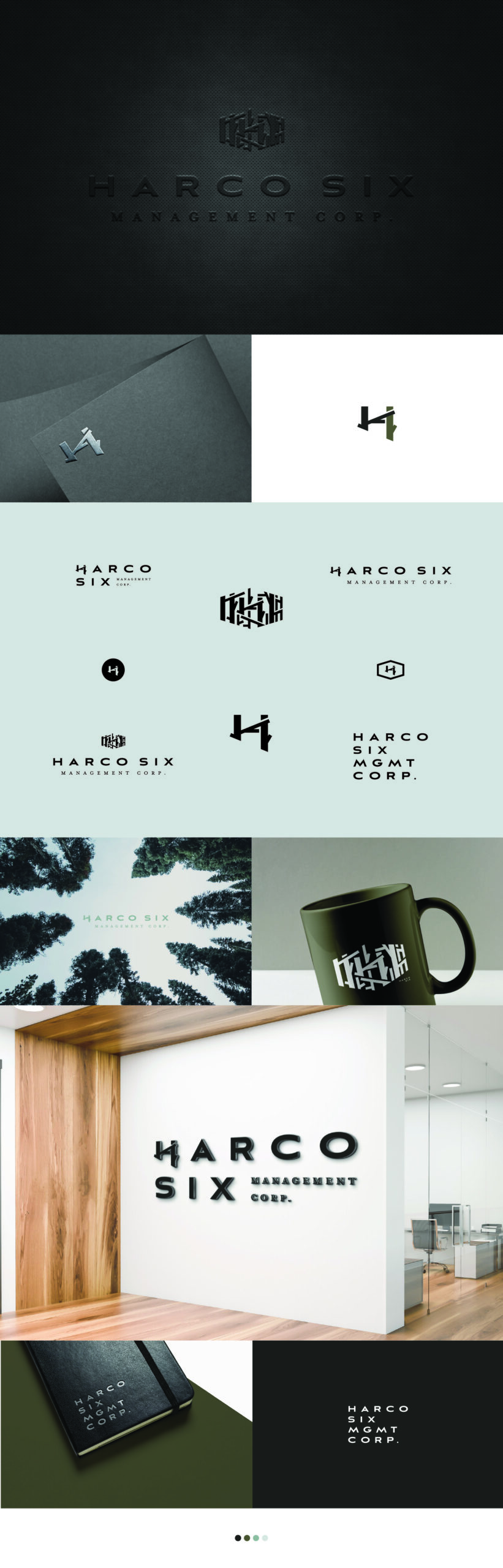
Harco Six
VISUAL IDENTITY | LOGO DESIGN
A modern and clean design inspired by the Harrison family of six; with 6 stems making up the “H” brand mark whilst working within the logo marks and alone as per the brief. Collectively, the trustworthy colour palette, strong imagery choices, sturdiness of the brand marks, and the versatility of the logo system has concluded the crisp visual identity for Harco Six Management Corp.
_